Our Vision
Our Visual Identity
Geraldine R. Dodge Foundation's visual identity system is rooted in our vision and guided by our organization’s attributes.
Geraldine R. Dodge Foundation's visual identity system is rooted in our vision and guided by our organization’s attributes.
The Dodge Foundation is an organization in transformation, and it will be for some time. Over the past few years, we have accelerated our efforts to center racial equity and justice in our work. We felt it was the right moment to refresh our visual identity.
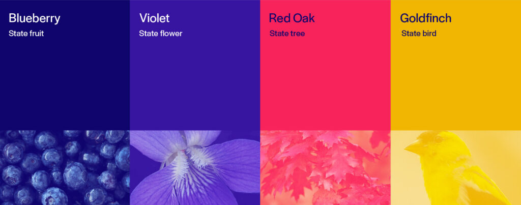
Our color palette celebrates its sense of place by dedicating each of its primary colors to a symbol of New Jersey: blueberry, violet, red oak, and goldfinch. Individually they are bright and confident, together they are joyful and bold. Our brand guide provides guidance on using this primary palette and a secondary palette to create beautiful and accessible combinations of color and typography in digital and print applications.
Our logo mark captures the transformative work the Dodge Foundation has, and continues to participate in. It embodies an infinite bend towards justice, and the transformation that happens therein. It travels from a rigid and thin starting point to a beautiful and bold curve.
Our logo matches our name with our mark. Our logo can scale with us. It is available in full, reading “Geraldine R. Dodge Foundation” as well as an icon so our identity can be present and impactful at any scale.
Our name is set in Halyard Display, an approachable and modern typeface designed by Joshua Darden, a Black American type designer and founder of Darden Studio. The Dodge Foundation visual identity leverages several weights of Halyard Display to ensure legibility and visual interest.